Web Design Concept2026
Annerley Dental
A homepage redesign concept for a Brisbane dental practice. They're not a client.
- Industry
- Dental
- Location
- Brisbane
- Scope
- Homepage redesign
- Status
- Concept
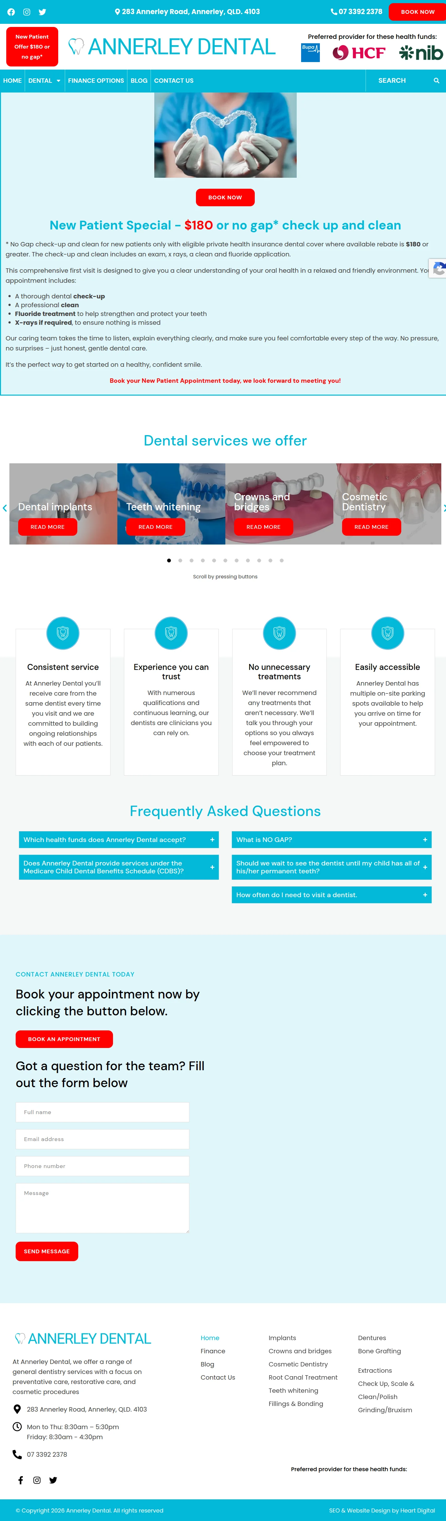
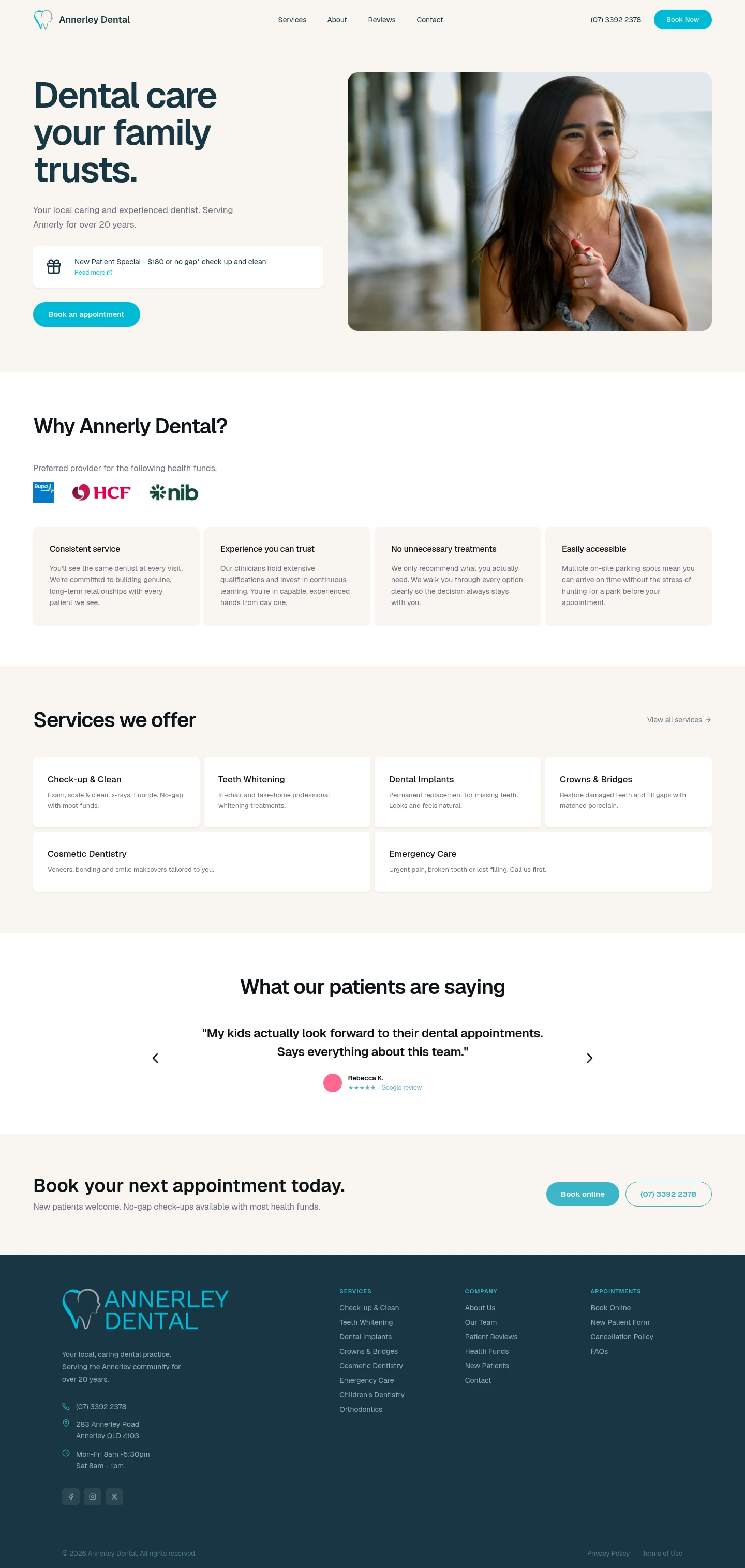
Annerley Dental has served the same neighbourhood for over 20 years, but its website uses a template that looks like many other clinics'. We redesigned the homepage to show why someone should choose this practice.
What we changed
- Editorial layout
- A split hero and editorial type replace the four-column icon grid.
- Trust signals up top
- Health fund logos sit in a bar directly under the hero.
- Why us, then services
- A values section comes before the list of treatments.
- One booking action
- Every call to action leads to booking an appointment.
Keen to work together?
Tell us what you're working on and we'll get back to you within a day.